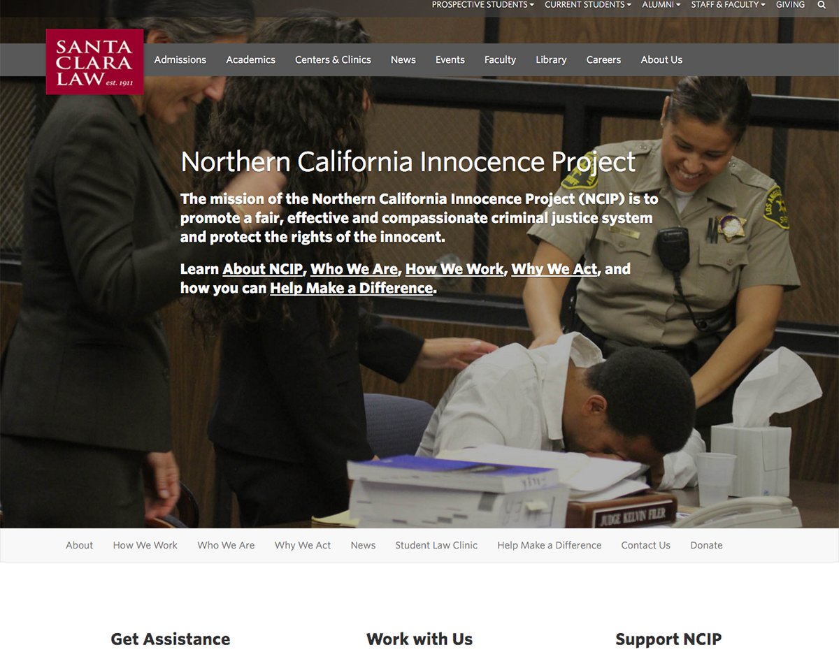
On Thursday, March 17, the Santa Clara Law Digital Media Team soft-launched NCIP’s new website.
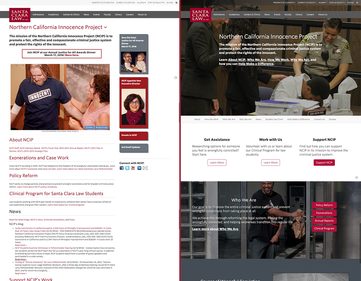
Before/After
The new website is:
- Focused on measurable objectives
- Designed around content experiences
- Streamlined for simple navigation
- Attractive on desktop, mobile, and other devices
- A big step forward from their previous design
Not including initial planning meetings, this new site was built and turned around in about three weeks.
How did we do this?
By breaking the website design process down into simple steps, and with the excellent support of NCIP, this project was able to be successfully deployed in less than a month.
Step 1: Determining Objectives and Goals
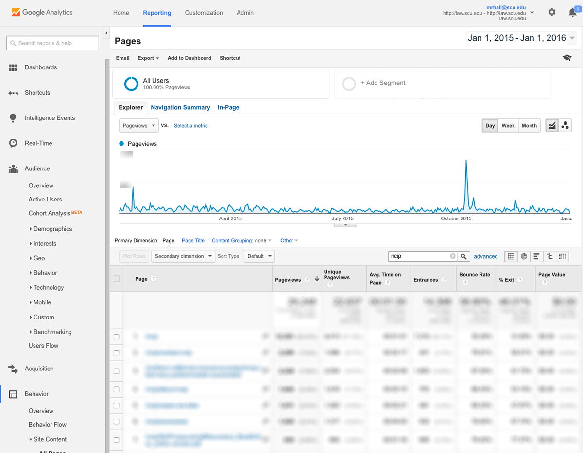
NCIP User Behavior Information via Google Analytics
After reviewing website user data for NCIP’s site, I determined the following:
- What people wanted to get from NCIP’s site
- Which pages were being used (and which weren’t)
- How we could improve the website navigation to streamline user experiences
I took this data to the first meeting with NCIP. After presenting it and getting the team’s feedback, we determined the top business objectives we wanted to accomplish with a new website design.
(As a reminder, business objectives are measurable goals that help organizations plan actionable steps and campaigns. “Increasing donations 10%” is a good business objective; “Boosting awareness” is not because it can’t be easily measured.)
Step 2: Mocking Up a New Design Based on Objectives
Once we had our objectives and goals, we were able to design a new landing page that visually supported the desired user paths.
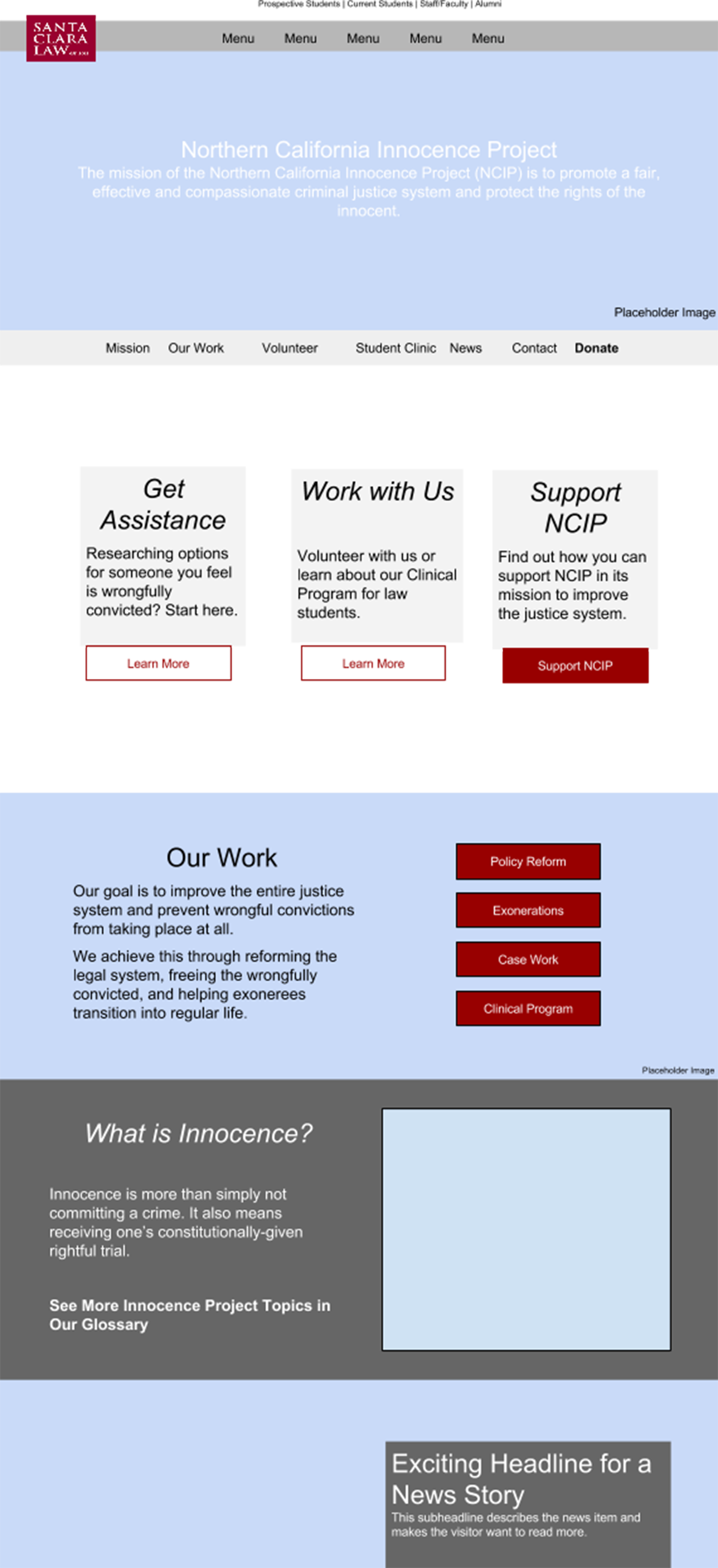
In Google Drive, I created a simple mockup with placeholder text based on current website content, analytics reports, objectives, and other factors. Then I delivered this mockup to NCIP’s team for review.
After a few rounds of revision, we had an idea of what we wanted the new homepage to look like. Though our current web development capabilities are limited, Michelle Waters did a fantastic job coding the homepage mockup.
Step 3: Planning New Website Content
With the homepage experience planned, we needed to reimagine how the rest of the site content would contribute to the overall audience experiences on NCIP’s site. I performed a content audit of their existing pages, then determined how they could be restructured for a simpler, more user-friendly experience.
In many cases, I simply combined multiple pages into one. But there were other cases (such as in the exonerees) where we needed to create new pages and split up existing information.
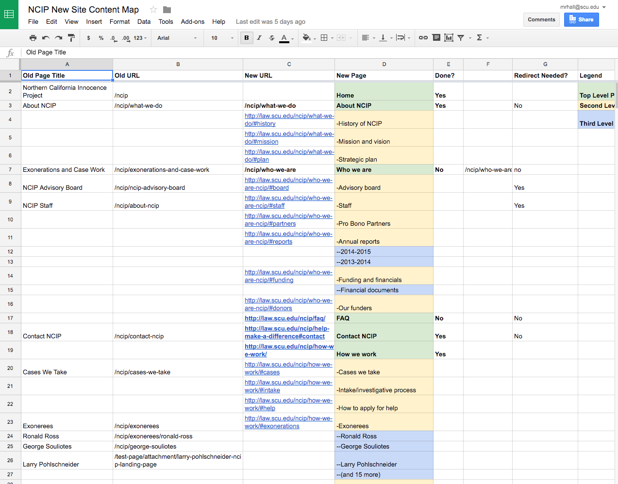
I created a new website content map to keep track of all this so we wouldn’t have any broken links, missing content, or bad pages when the new site launched. This website map was presented to NCIP’s team for review and to ensure they knew exactly what content they needed to deliver.
Step 4: Building the Site (and Revisions)
Michelle Waters worked hard to turnaround the individual web pages in record time. With the approved new content map, we knew exactly:
- Which pages needed to be created
- Which URLs were no longer being used and thus required a redirect
- How menu structures would appear on a page-by-page basis
This is where the grunt work came in. It took a lot of hours (and we’re still recovering), but we were able to finish a shippable version of the site before NCIP’s deadline.
The Digital Media team worked to get revision requests from NCIP early and often. Even just a few hour-long meetings were enough to make quick changes (such as swapping images, spacing adjustments, or copy revisions). These revision meetings made forward progress predictable and steady.
For example, after seeing the photos we chose live on the website, we decided we wanted something more compelling. Our in-person revision meetings allowed us to test multiple photo options until we found the right combination of images to support NCIP’s mission and message.
Step 5: Iterative Development
NCIP’s website isn’t “done.” It won’t be – ever. As user behaviors evolve with changing technology, commercial website trends, and other factors that shape their expectations, we need to adapt. However, with the work we did in streamlining the site, the next redesign should (hopefully) be more cosmetic than substantive.
Why This Went So Well
Despite the fact there will be regular, iterative updates to the site, NCIP’s new website launch is basically done – and in record time. Here’s why we were able to turnaround this project so quickly:
- NCIP set aggressive deadlines, then met them. Executive Director Hadar Harris and the rest of the NCIP’s team weren’t shy about pushing themselves to make the redesign a priority. They knew their self-imposed deadline of March 17th was tight, but they worked to plan backwards and set mini-deadlines along the way. They consistently provided all deliverables on time – a huge help.
- NCIP provided site content. With a two-person team (1.75 FTE, technically), Michelle and I are limited in the kinds of web content we can produce at the moment. Fortunately, NCIP’s team created all of the written and visual page content. All Michelle and I needed to do (after coding the page) was insert NCIP’s content and add hyperlinks when appropriate. Without this, the project would have failed.
- Both parties communicated openly and quickly during this process. Since we knew we were under deadline, both NCIP and the Digital Media team worked to respond quickly to emails, phone calls, and other communications. This helps resolve potential errors quickly and enable forward progress.
- We embraced iterative design. Creating a website is different than most academic projects. When you submit an article for publication in a peer-reviewed journal, for example, it needs to be perfect. The great thing about launching a website is that it doesn’t need to be perfect. We can always correct (and indeed, we will during the iterative development phase). NCIP embraced this and didn’t let perfectionism prevent them from shipping the site on time.
View NCIP’s New Site
As mentioned, NCIP’s new site is now live. Go check it out when you have a moment – it looks great on both mobile and desktop browsers.
Though our resources are very limited, the Digital Media team hopes to perform similar website redesigns for all Law School centers, clinics, and other organizations. If you know when your organization will be able to commit to the design process outlined above, contact us by emailing me (mrhall@scu.edu) and Michelle Waters (mmwaters@scu.edu). We’ll plan a block of time to plan, develop, and launch your new site.
